
Folkitchen main page
Branding and Development
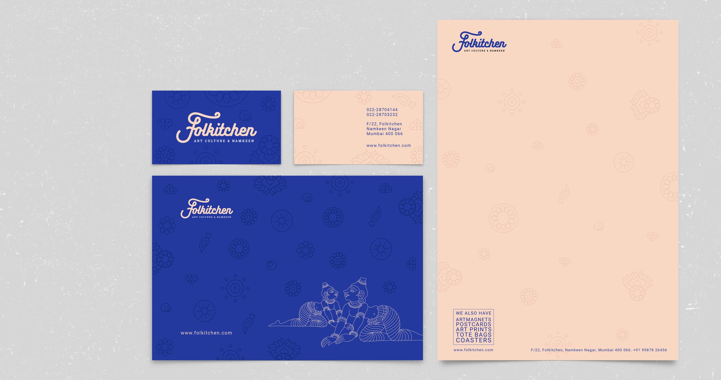
FOLKITCHEN

About the logo:
The logo design aims to reflect the rich history of Namkeen (Indian savory snacks) and folk art. As both have historical significance to their making, the goal was to showcase this in a contemporary form.
Concept and construction:
The concept incorporates an 'unfolding scroll' symbolising the unveiling of the snack's secret recipe, elegantly depicted through the majuscule swash of the letter 'F'. Additionally, the brand name visually concludes with an upright exit stroke of the letter 'n', symbolizing 'guidance and carrying the legacy forward.' The use of 'Bukhari Script' with minor customization was an approved visual choice, as it resonated with the narrative and subtly told the brand's story.


The process:
The process of creating the typographic logo involved a series of steps, starting with pencil sketching and culminating in the construction of typographic grids for customisation.
In the initial phase, pencil sketching allowed for exploring various ideas and compositions, giving shape to the vision of the logo. It provided a hands-on approach to visually represent the concept and refine the design elements.
Moving forward, the sketches were translated into digital format and ‘Bukhari Script‘ was matched accordingly. Here the typographic grids came into play. These grids served as a framework to ensure precise alignment and proportion of the logo elements. By adhering to the grids, the logo achieved a harmonious balance and consistency, enhancing its visual impact.
This meticulous customisation lead to an impactful modifications that captured the brand's essence.

Folkitchen main page